ABET Sustainability Campaign Design
ABET is a higher education accreditation nonprofit, focusing largely on STEM programs, that currently accredits 4,863 programs at 950 colleges and universities in 42 countries. I worked for ABET on a six month contract, designing a wide variety of materials spanning digital and print, from trade show booth designs to web ads. I crafted the identity of several of ABET’s campaigns, including their Cause Awareness, Sustainability Microcredential, and Upcoming Events campaign.
November 2025-March 2026
Supervisor: Shannon Fitzgerald, Creative Manager at ABET
Challenge:
ABET needed a campaign identity for its Sustainability Microcredential, a certification that focuses on accreditation in sustainability science and practices. It had produced a few materials around the campaign, but needed to flesh out its identity to create a look and feel that was was separate from its main branding, and which evoked themes of sustainability and the natural world. The materials that ABET produced were very simple; while the photography choice were good, the color palette and typography were not cohesive or harmonious.
Process:
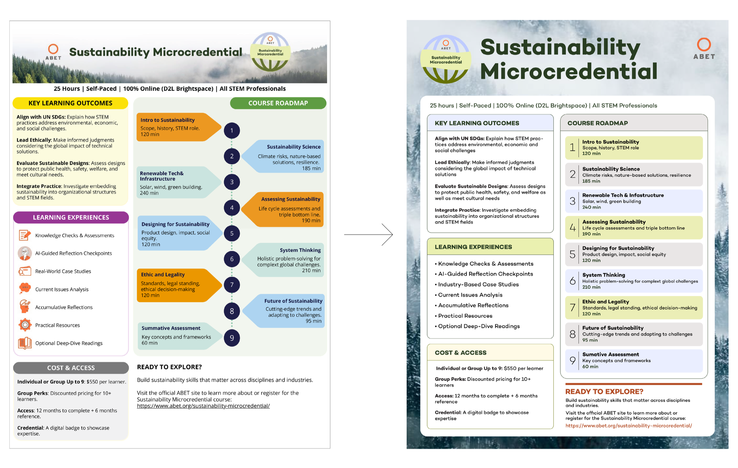
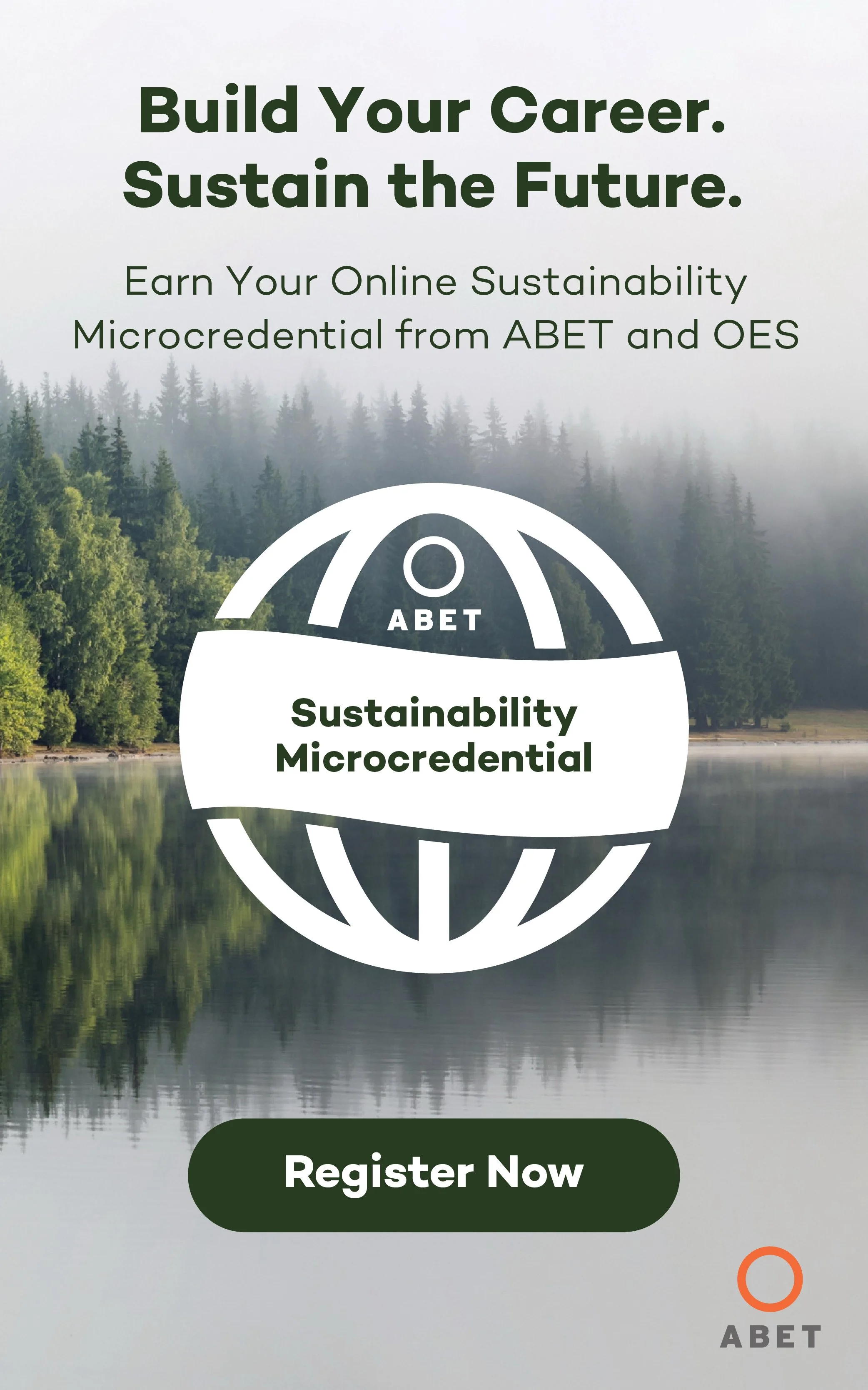
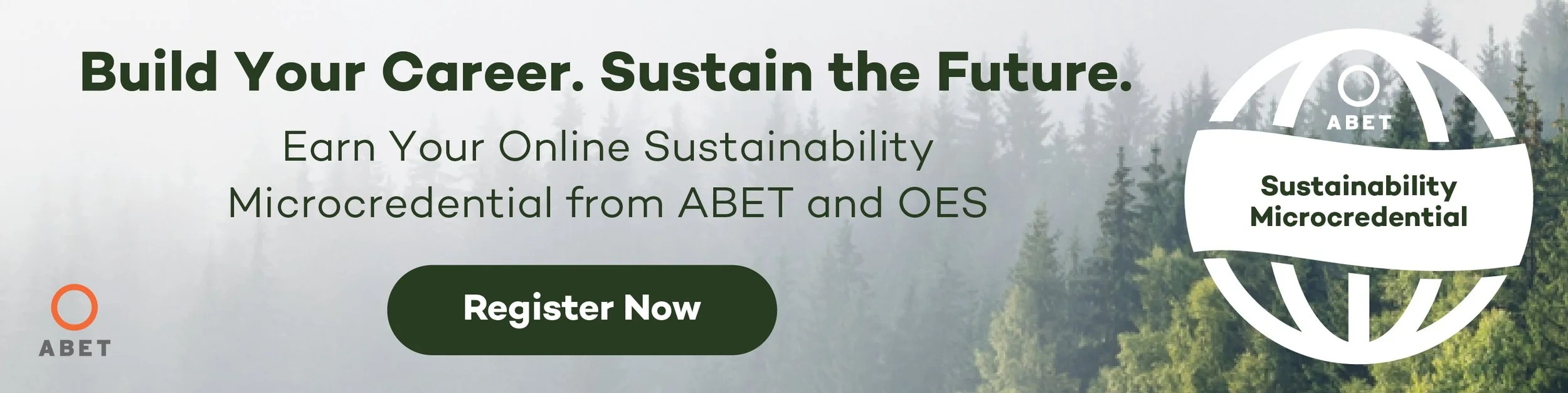
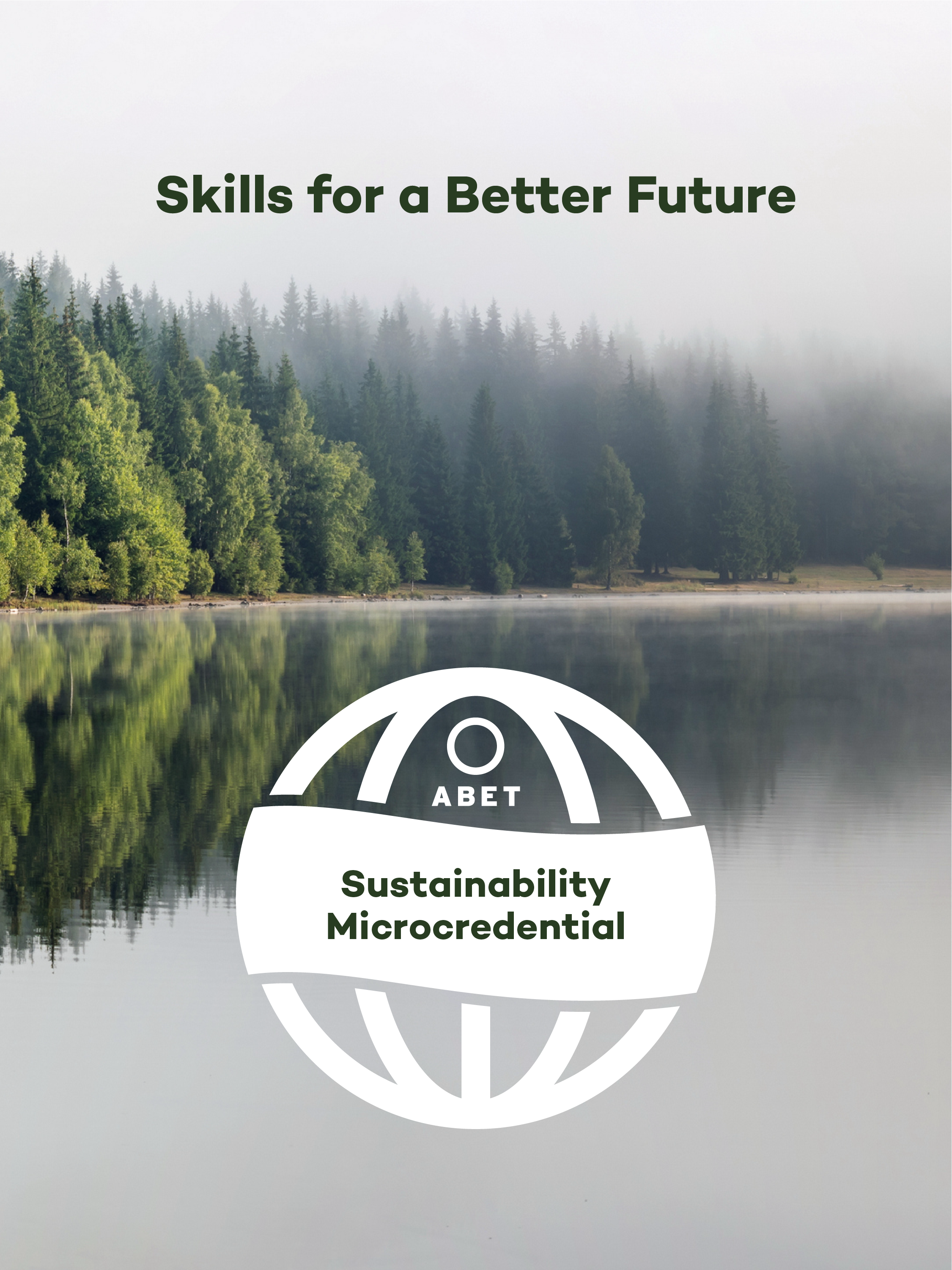
To begin the process of creating the campaign identity, I used the existing campaign materials (shown below) as a jumping off point. The photography for the campaign in the existing web ad (below, left) featured airy, misty photography that is a departure from the green and leafy photography that is often used for campaigns about sustainability and the environment. The photography selection was very effective, and I used it as a basis for other choices I later made about color and typography.
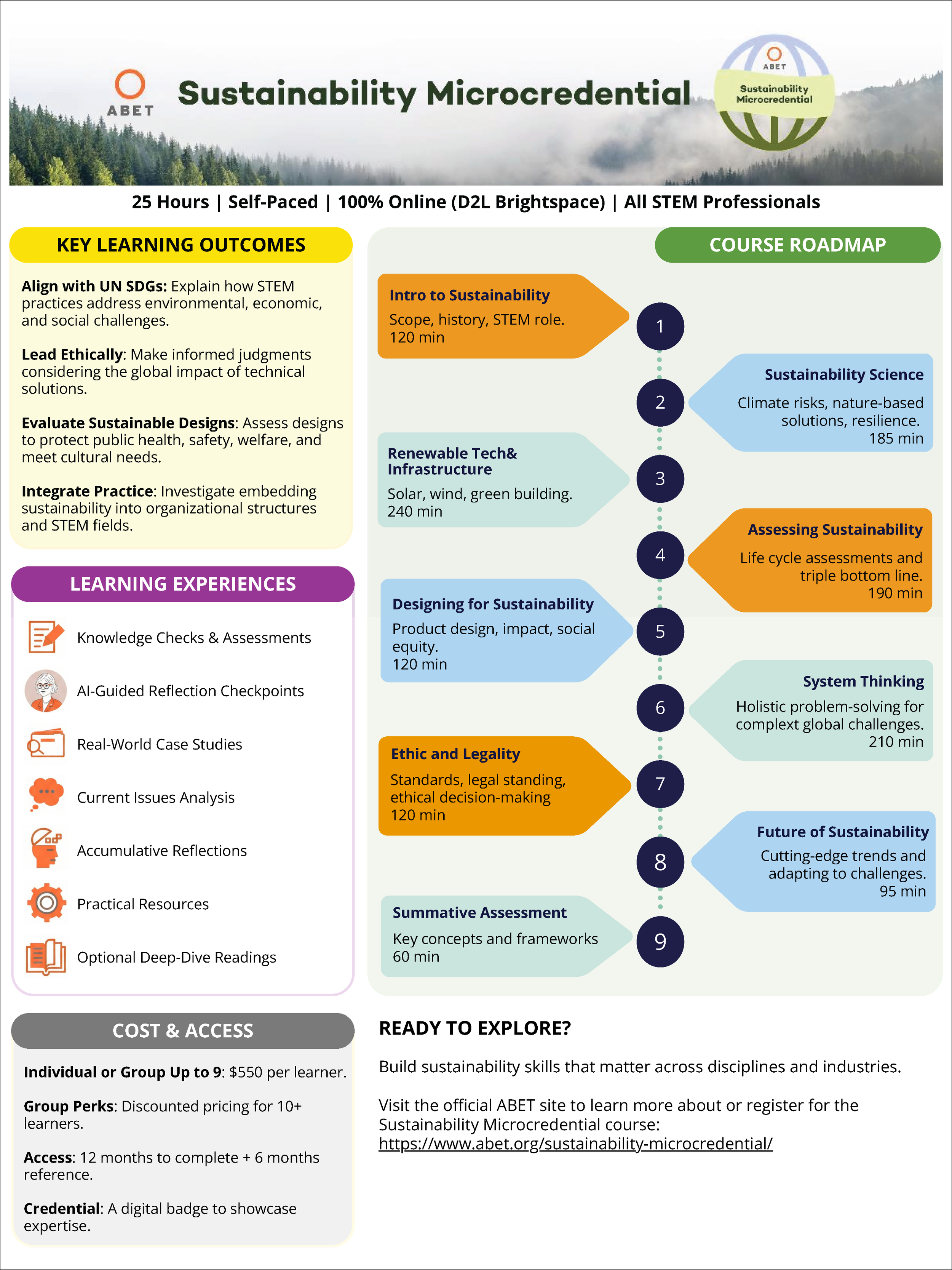
The fact sheet poster however (below, right), felt very out of step with the theme of sustainability. The title bar and rest of the poster felt very disconnected in both color and weight. The colors palette clashed, and the icons looked copy and pasted and not bespoke.
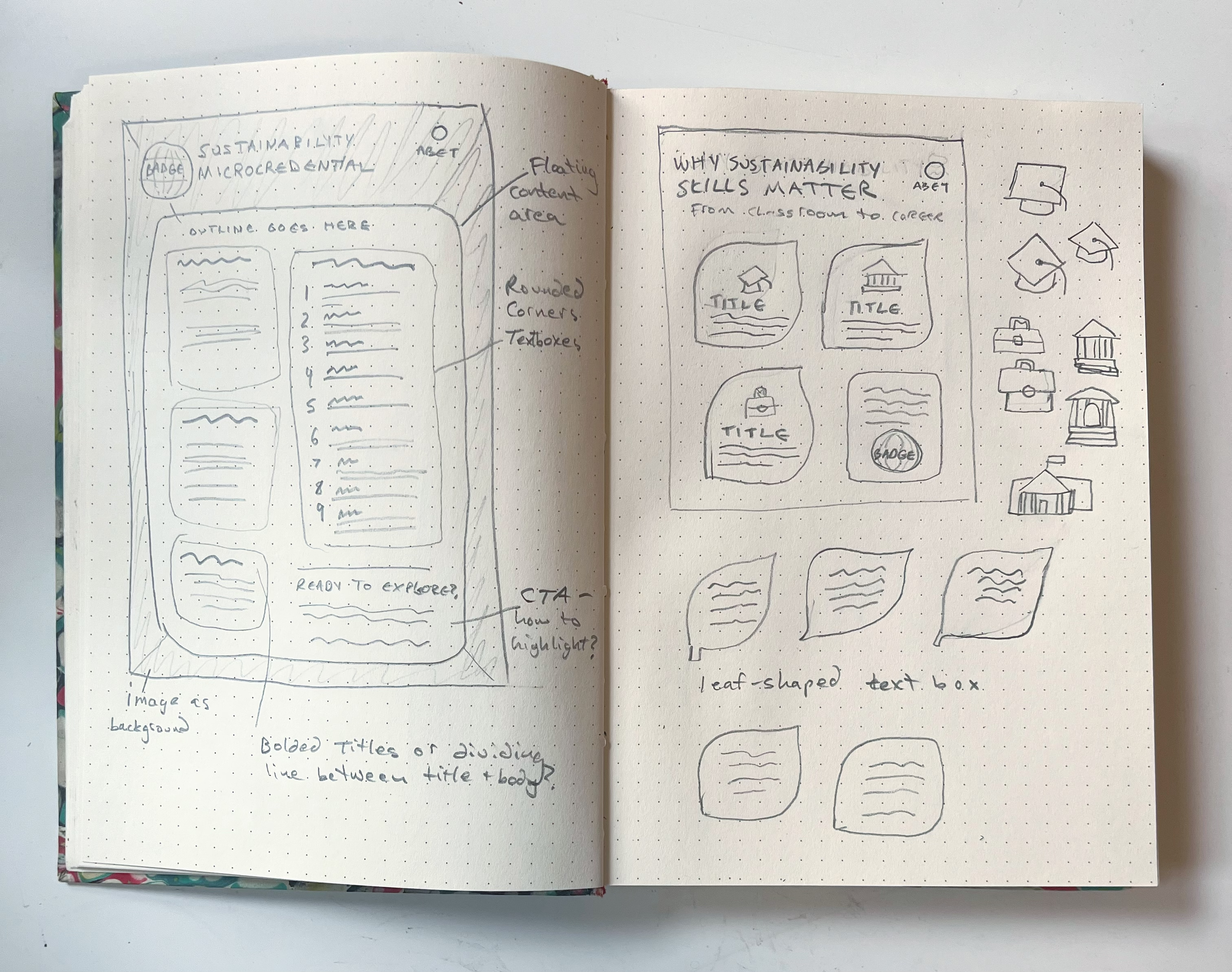
I began sketching and experimenting with ways that the typography could compliment the photography, and how to organize the typography on the sustainability fact sheet poster that would feel balanced and cohesive. I also experimented with some of ABET’s secondary brand colors to see which color pairings worked best with the campaign.
Existing Campaign Materials:
Sketches:
Solution:
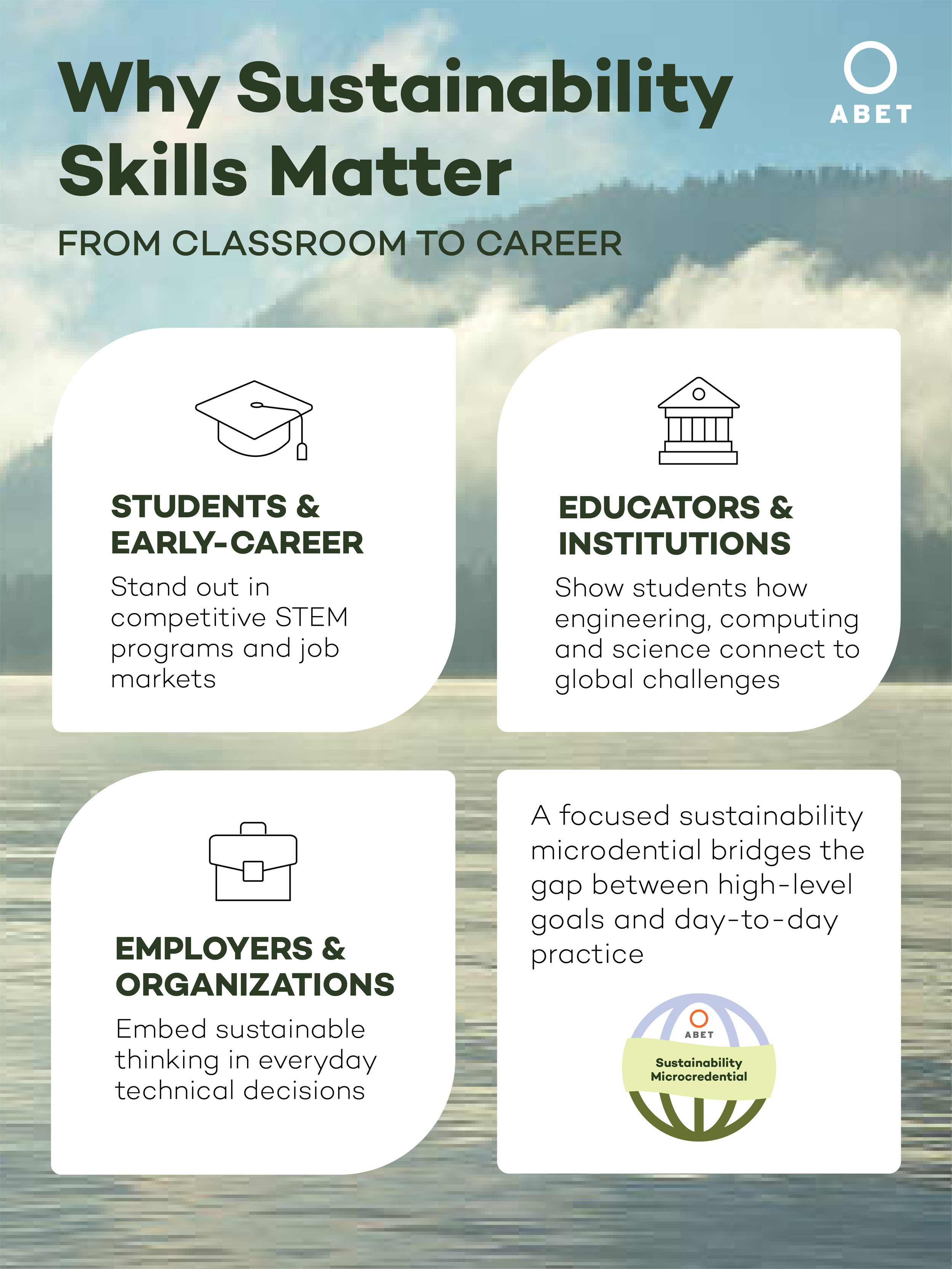
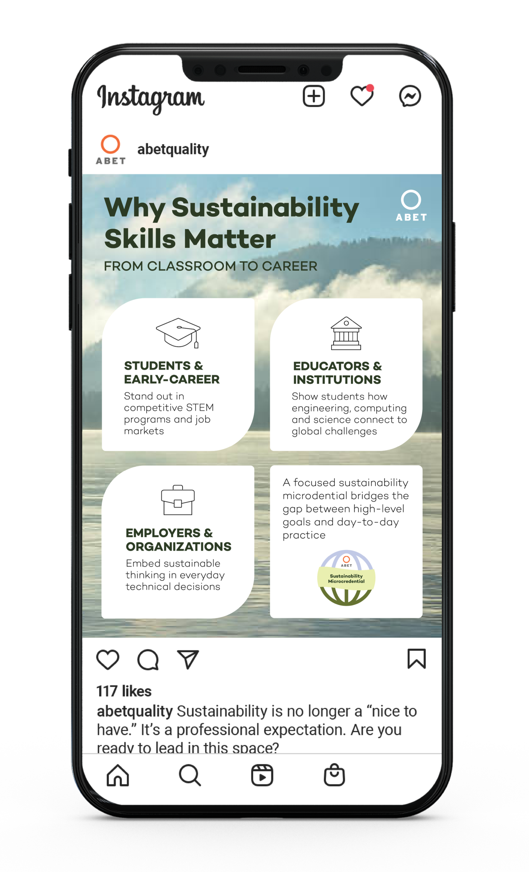
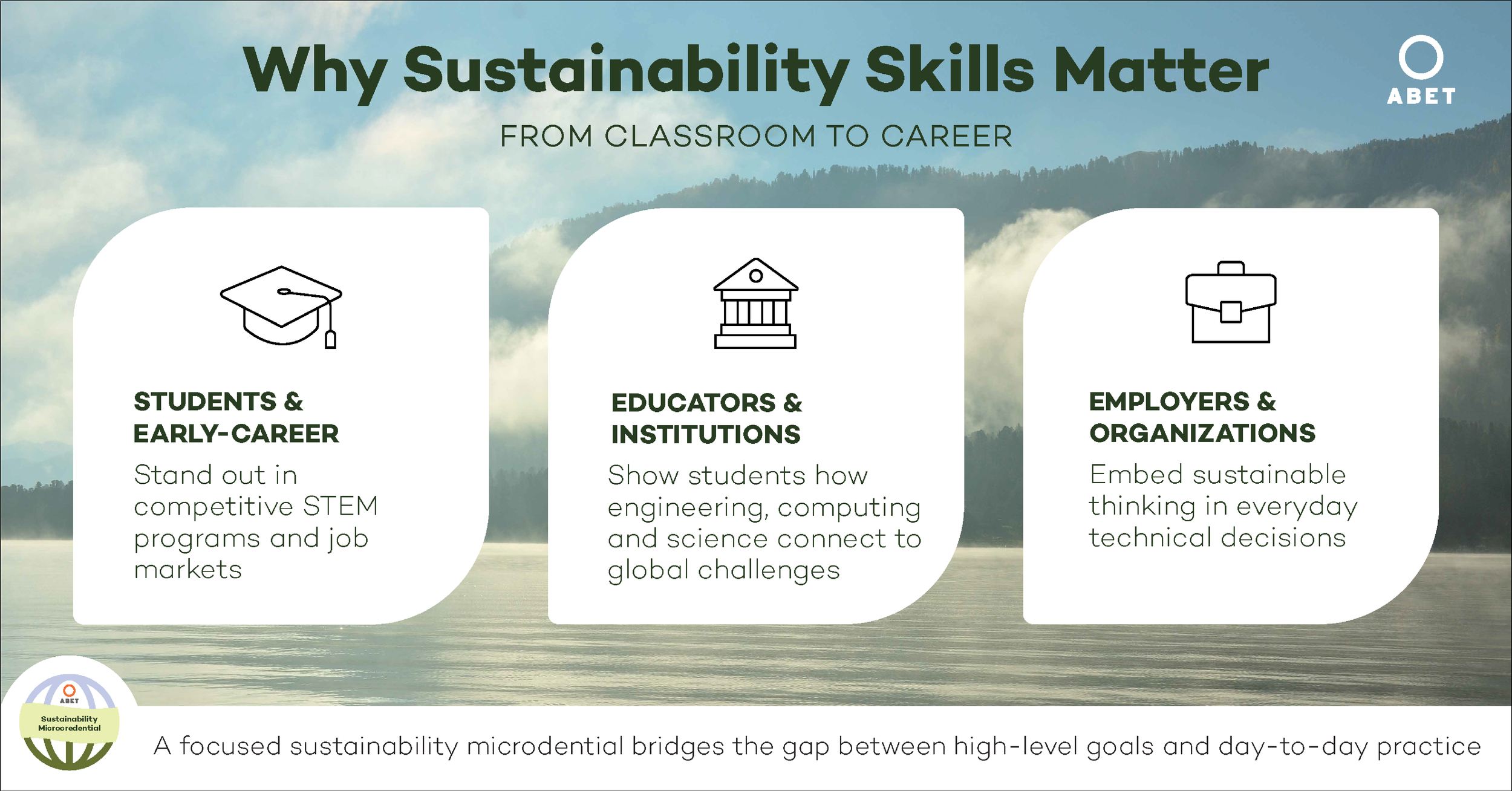
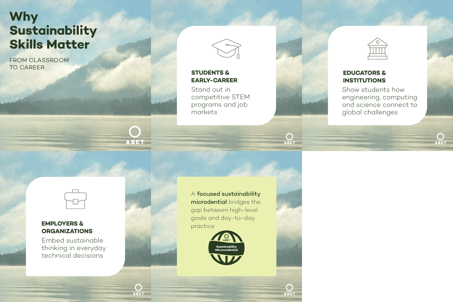
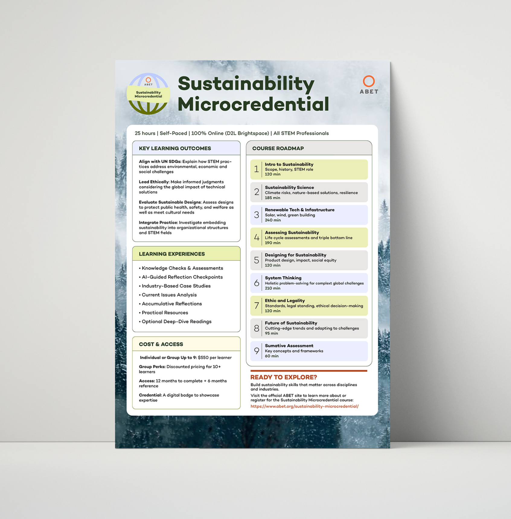
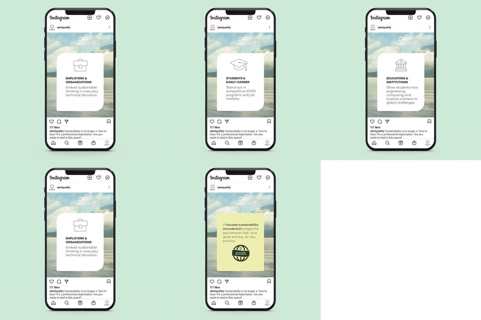
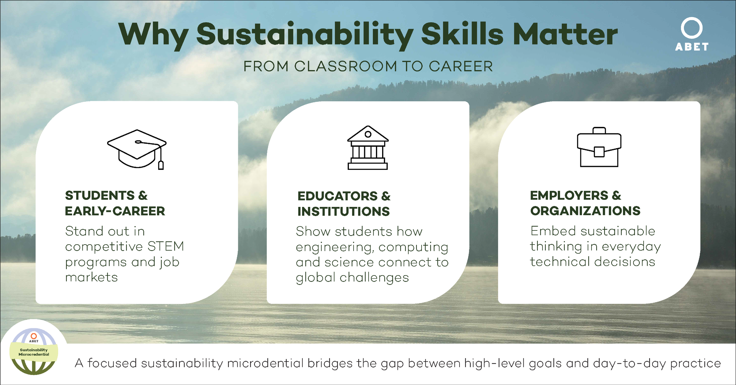
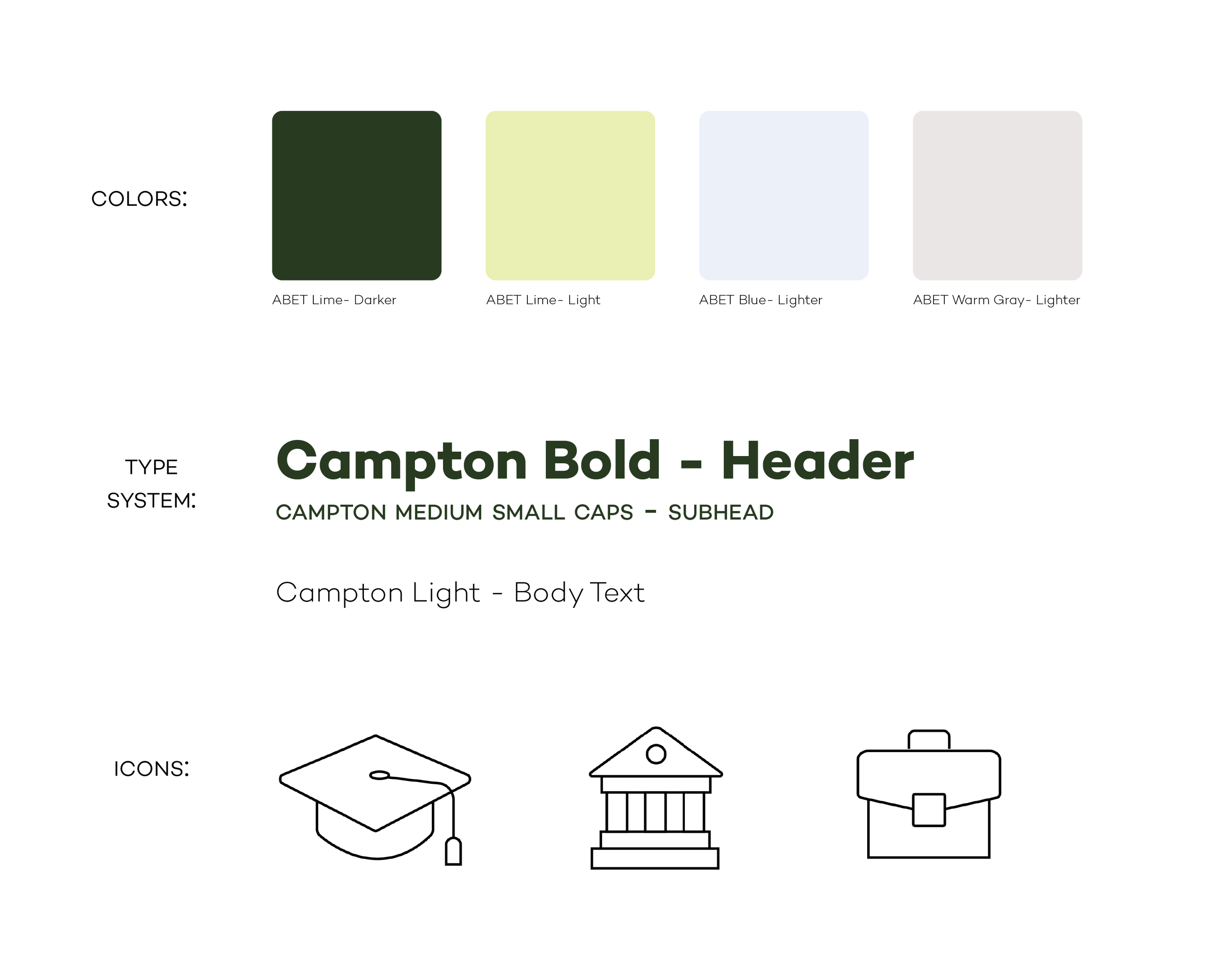
I created an identity system for the Sustainability Microcredential campaign that used photography to create a backdrop for overlaid text boxes, giving the designs depth and a feeling of serenity. I used some of ABET’s secondary colors— a dark green for headings and soft, light blues, greens and greys for text boxes and highlights, ensuring that the campaign was distinctly different from ABET’s main materials, which emphasize their primary orange, while still adhering to their overall brand guidelines. Because the feel of the campaign was light and serene, I rounded the corners of the text boxes to give them a softer feel. I also created textboxes in an abstracted “leaf” shape as a nod to the subject matter of the campaign. The light body text and minimal, lightweight icons also create the feeling of harmony.
Outcome:
The expanded identity I was able to develop for the Sustainability Microcredential were well-received by the creative department at ABET, who will use the continue to use the identity as a basis for future materials around the campaign.